Primary Logo
The main logo features a tilted smiley within the letter O, followed by the capitalized wordmark (ORDRZ). The tilted smiley symbolizes positivity while also representing the concept of a website being loaded.

Primary Logo
This is the main ORDRZ logo. It should be used in this form whenever possible.

Inverted Primary Logo
This version features a white logo & wordmark for greater legibility on dark or busy backgrounds.
Monotone logos
Use the monotone logo when the primary or full-color options can't be used. These are some conditions that make it impossible to use the primary or full-color options:
- Budget constraints
- Brand consistency
- Busy or patterned backgrounds
- Printing limitations
- Backgrounds lacking sufficient contrast

Monotone Black
Monotone White
BrandMark (ORDRZ)
There are few circumstances where our brand mark, the ORDRZ O, can represent the brand on its own without the complete wordmark.
- Social media profiles allowing for instant brand recognition even without the complete wordmark.
- Where there is limited space, such as serving as a favicon for the brand’s website.
- For mobile app icons, making it easily identifiable on users’ home screens & app lists.
- In certain advertising campaigns to capture viewer attention & reinforce brand recall.


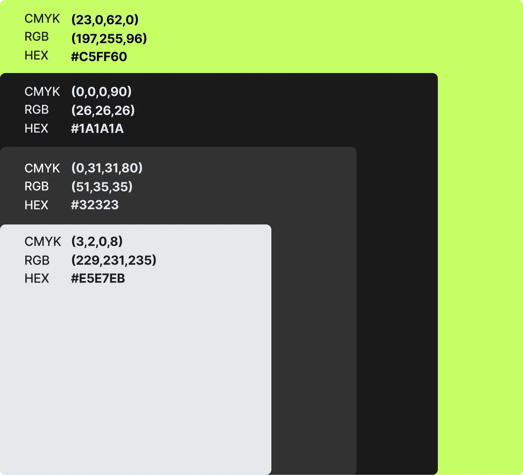
Color Style Guide
Please note that these color guidelines are meant to provide a general understanding of the brand's color palette and their associated meanings. The usage of these colors should be considered in the context of specific design applications and brand consistency.
- Green, representing the key attributes of money, innovation, and immortality. It symbolizes the brand's focus on financial growth, creative thinking, and lasting impact.
- Black & grey, used as complementary colors to add balance & versatility to the palette. They help improve clarity on busy or patterned backgrounds or backgrounds without enough contrast.
- White, reserved for situations where legibility or contrast is a concern. It provides a clean and minimalistic backdrop, ensuring clarity and visibility of content.